This is the trailer for 'The Hurt Locker' an action/drama film which is the same genre as my trailer. The first thing that happens in the trailer is the characters are introduced to the viewer but at the same time as they are being introduced to each other in the film. In this short clip over the shoulder shots are used to establish a first person view, this scene also establishes that the two characters are in some area of the armed forces. The next part of the trailer shows that they are in a bomb disposal unit, throughout the trailer you get a small understanding of the two characters relationship in that one is the strict leader the other is more of an adrenaline seeker who constantly shows a disregard for danger the same character also has many humorous lines in the film which convey his disregard for danger. Throughout the trailer there are jump cuts to a black background with captions and phrases on which are associated with the film, these are used so that they will be remembered because they are flashing up and will be related back to the film. Halfway through the trailer pops up a list of academy nominations for the film this is to show the audience that the film is viewed highly enough by professionals to be nominated. In terms of audio and soundtrack in this trailer, played in the background is the sound of a ticking bomb it keeps playing up until a large explosion partway through the trailer this builds the suspense for the audience as they know there is some sort of explosion coming in the trailer.
Friday, 15 October 2010
Friday, 10 September 2010
Dark Night and Inception posters

The Dark Knight poster and the Inception poster are both very similar in their layout. This is because both the films have the same director and are using the same marketing styles and techniques. In both posters the majority of the layout is taken up by buildings which dominate the skyline and the poster, also in he Dark Knight poster the character known as 'the joker' has his back turned the Inception poster follows suite and Leonardo Dicaprio also has his back turned. Both the characters are also holding things in their right hands, the joker is holding a knife and the character played by Leonardo Dicaprio a gun, these are both weapons signifying that their charcters are either violent during the film or are the villains. Both poster also are brightest in the centre and as you move further out from the centre it appears to get darker. These two posters being the same is an example of intertextuality.
History of trailers
The first ever movie trailer was shown in the US in November 1913, it was created by a man named Nils Granlund who was the advertising manager for the Marcus Loew theatre chain. The trailer he made was a short promotional film for the musical The Pleasure Seekers, which was opening at the winter garden theatre on Broadway. In the trailer featured short clips of the rehearsels for the show. Granlund was also first to introduce trailer material for motion pictures, he using a slide technique to promote a film featuring Charlie Chaplin in 1914. Up until the late 1950s, trailers consisted of key scenes from the film being advertised often with large descriptive text describing the story. Most trailers had some form of narration those hat did had a very dominant males voice played over the top of the trailer. a very good example of this is the 1950's trailer for Walt Disneys Cinderella.
In the 1960 motion picture trailers changed. They became textless and montage trailers and quick-editing became popular, this is because of the arrival of the new Hollywood era and techniques that were becoming increasingly popular in television. One of the better known for their trailers at the time was Stanley Kubrick who favoured the montage technique. A great example of his work is the trailer for Dr. Strangelove.
The modern day trailer consists of a soundtrack that can quickly build suspense and just as quickly slow the tempo down, fast cutting often action scenes that do not give away too much of the film. Often one film will have many different trailers including a teaser trailer which is just a shorter version of the main trailer.
Inception Trailer analysis
This trailer for Inception does not give much of the film away, although it shows some short action clips and diologue it still leaves the viewer pondering what the genre of the film is and what the story and the plot are. The effect that has on the audience is that it intices them in and makes them want to know more about the film, so they have to go and see it for themselves. The soundtrack to this trailer is very important because when the music pics up the scenes in the trailer get faster and the cuts from one to another are also much faster. The soundtrack also plays a big part in building up the suspense. During the trailer just before the tempo pics up it displays 'from the director of the dark night' by doing this the film is automatically associated with the dark night through the director and because the Dark Knight was a very popular film the audience then thinks that Inception is also going to be a very good film. The trailer does not give away any of the characters names but in most of the clips Leonardo Di Caprio features leading the audience to believe he is the main character.
Monday, 19 July 2010
Inception Poster Analysis
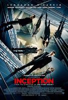 In the first of the three Inception posters the first thing you notice when you look at the poster is that the back drop is the same street the characters are standing but twisted and bent up, so it is now a vertical wall, this may be because the director wanted the viewer to think that the settings and the scenery play a big part in the film. Also the buildings in the poster are large buildings which tower over the characters this may be to show that the characters are in some way restricted or restrained by the buildings or the setting. Leonardo Dicaprio is at the centre of the poster and is the furthest forward out of them all, this may be to show that he is the main character and he appears most across the whole film. The same applies to the characters who are at the back this could be to show that they are not as important as the characters further forward or it could be to show they are a villain or an underdog in the film. The woman in this poster is the only woman and she is dressed more casually than the men in the poster, she is also wearing a red jacket this could be to show she is a love interest for one of the characters. Also three of the men in the poster are carrying a gun of some sort, this could be a clue to what sort of role they play in the film and also tells the viewer a little about what sort of genre the film is. The men in the poster are all dressed in suites or blazers this may be to show they are all part of the same profession or maybe they are all very professional in the jobs they do.
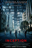 The second poster like the first has Leonardo Dicaprio as the main centre of the poster he is again the furthest forward indicating that he could be the main character of importance in the film. Like in the first poster the buildings and the scenery play a big part in this, this time all the buildings are twisted and pointed in different directions this may be to show that the buildings in some way have dominance or control over the characters. In this poster there is a second woman she is dressed more casually than the other woman in the poster and is holding a gun, this could be to show that this character is not a stereotypical woman and can take her of herself therefore the other woman may be the damsel in distress. This poster does not show Leonardo Dicaprio holding a gun unlike the previous poster, this may be because the director is trying to show different sides to the character and that he is not just a violent person. More of the men in this poster are carrying guns and two of them are carrying silver metal briefcases, these may be to transport weapons or documents, either way it is something of importants to the characters and has an element of secrecy about it. Like the first poster all of the men in this poster are dressed smartly except for the one at the top who looks furthest away and is upside down, the reasoning behind him not being dressed like the others could be because he may not be linked in with those characters as much or he could be set out from the bunch as the underdog of the film or possibly even the villain.
The third and final poster is different to the others in that there is only one character in it opposed to the others two posters which have at least six characters in each. Leonardo Dicaprio is the main focus of the poster, again he is dressed in a suite maybe to show he is professional at what he does and he is also holding a handgun this could suggest that his character is violent or it could also suggest something about the type of film it is. There are some things in this poster that seem out of place, for example the character appears to be in the middle of a city but he is also knee deep in water which appears to be flooding the city and crashing off the buildings, this may be to represent chaos or a chaotic event in the plot of the film. In this poster the buildings seem to tower over the character even more so than in the other two posters, this may show that the scenery and the buildings have control over the characters and the water coming in may suggest it is also the environment and not just the buildings that are controlling the characters.
All three of these posters have certain things in common, they all have the majority of the frames taken up by large buildings that tower over the characters this may be to show that the characters are controled by their surroundings. A lot of the characters in these posters are dressed very formally and look professional this suggests that perhaps they all do the same job. The first two posters both have six or more people in them, the same character is always the centre of the frame and the same two characters are always furthest back in the poster. Leonardo Dicaprio is always the furthest forward and always central to the frame, the same woman and man are always furthest back in the frame, the man is not dressed as formally as the others this suggests that he may not be as much associated with the other characters he may also be the underdog of the film and could even be the villain. In all the posters there are some characters carrying or holding guns, this may be to show that their character in the film is dangerous or violent it also may be a hint towards the genre of the film. The buildings which are in all of the posters are never just normal buildings, in the first poster the whole street is turned up to and made into a wall this may be to represent that the characters in the film have to overcome the ever changing scenery. In the second poster the buildings are coming in from all different directions this may have the same reasoning behind as the first poster and the final poster the buildings look normal but the scene does not look normal as the there are waves crashing in and it supposedly the middle of a city. Finally there is a light in the middle of every frame and the borders of the poster are darker and because Leonardo Dicaprio is always the central focus the light may be to show that he is the hero of the film and the surrounding characters in the posters are more towards to the darkness this could mean that they are more on the villainess side.
All three of these posters have certain things in common, they all have the majority of the frames taken up by large buildings that tower over the characters this may be to show that the characters are controled by their surroundings. A lot of the characters in these posters are dressed very formally and look professional this suggests that perhaps they all do the same job. The first two posters both have six or more people in them, the same character is always the centre of the frame and the same two characters are always furthest back in the poster. Leonardo Dicaprio is always the furthest forward and always central to the frame, the same woman and man are always furthest back in the frame, the man is not dressed as formally as the others this suggests that he may not be as much associated with the other characters he may also be the underdog of the film and could even be the villain. In all the posters there are some characters carrying or holding guns, this may be to show that their character in the film is dangerous or violent it also may be a hint towards the genre of the film. The buildings which are in all of the posters are never just normal buildings, in the first poster the whole street is turned up to and made into a wall this may be to represent that the characters in the film have to overcome the ever changing scenery. In the second poster the buildings are coming in from all different directions this may have the same reasoning behind as the first poster and the final poster the buildings look normal but the scene does not look normal as the there are waves crashing in and it supposedly the middle of a city. Finally there is a light in the middle of every frame and the borders of the poster are darker and because Leonardo Dicaprio is always the central focus the light may be to show that he is the hero of the film and the surrounding characters in the posters are more towards to the darkness this could mean that they are more on the villainess side.
Subscribe to:
Posts (Atom)